Customizing a web card involves tailoring its content, design, and functionality to align with your specific goals, brand identity, and user preferences. Here are the steps to customize a web card effectively:
In the Web Card page editor, the Web Card is displayed on the right-hand side, and the Menu is displayed on the left-hand side. The Menu section includes the following.
- Elements
- Configuration
- Display Settings
- Card Settings
You can customize the Title, CTA, and Close Button by clicking on the Elements Icon in the Left Menu or clicking each element individually.
Elements
Click on the Elements icon in the left menu. This will list all the Elements in a web card.
- Floating Bar has 3 Elements: Title, CTA, and Close Button. Click on each Element individually to customize.

- Slide-in: has 5 elements: Image, Title, Sub Title, CTA, and Close Button. Click on each Element individually to customize. Click on the Eye icon to toggle the visibility of elements. Clicking on the icon allows you to either hide or show specific elements as needed.

Configuration
- Click the Configuration icon in the left menu, and the following message is displayed.

- Click the Web Card to display the Elements on the left Nav, or you can click on each Element individually to customize.

Clicking on the Image in the page editor opens the Image section, where you can edit the Image and adjust its Styling.

Add an image for the Web Card; the added Image is displayed in the editor page.

Click on the Title in the page editor. The Title section opens, and you can edit the Title and change the styling.

Insert Merge Tag: There are two ways to insert Tokens in the Title. You can also include tokens in the Title by clicking Insert MergeTags, OR You can also insert tokens into the Content section by typing curly brackets '{{' wherever you want to insert them. Once you begin typing, a list of available tokens will appear for you to choose from. You can add Account, Account Visitor, and Data Provider tokens.
Click on the Sub Title in the page editor. The Sub Title section opens, and you can edit the Sub Title and change the styling.

Note: You can also include tokens in the Sub Title by clicking Insert MergeTags, which allows you to seamlessly add Tokens to the Sub Title field.
Click on the CTA on the page editor, and the CTA section opens. Under CTA,
- Button Text: Enter a name for the button.
- URL: add a URL to which you would like the visitor to be directed.
- Report As: In the drop-down, select either
- None: to only reflect the CTA Clicks
- Conversion: to reflect the CTA Clicks and Conversions in the Metrics section for a Web Card, as well as in the Reports
Click on the Close button, and the Close button section opens with Content and Style options. You can select any option in the drop-down.
.
Note: Style Options are available for all the Elements. The Style options contain the following: Visibility, Typography, Border, Background, Spacing, and Dimension. You can make the necessary changes under each section. To learn more about styling, click here.


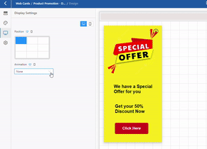
Display Settings
Click Display Settings on the left panel. Under Display Settings, you have two sections, Position and Animation.
Position:
A Floating Bar web card has two positions for Desktop and Mobile view. 
A Slide-in web card has nine positions for Desktop view and three positions for Mobile view. You can position the Slide-in Web Card on any part of the Web Page.
Animation:
You can select any Animation effect from the drop-down
Card Settings
- Click on Card Settings. Card Settings opens with two tabs, Content and Advanced.

- Content: To make the page more interactive, add JavaScript (Optional).
- Advanced Settings: Under the Advanced tab, you can use specific attributes and techniques to add more customization and control to elements. Here are three settings: Element Id, Class Name, and Custom CSS.

- Element Id: Use Element ID to link to a specific section of a page. Learn more about Element Id here.
- Class Name: Give a Name to define the Custom CSS for a particular section.
- Custom CSS: Create Custom CSS for unique styles and selectively apply it to specific elements, enhancing visual appeal and aligning with branding across the Web Card.
- Element Id: Use Element ID to link to a specific section of a page. Learn more about Element Id here.
- Once the changes are made, click Publish.
Note: Once a Web Card is published, it cannot be deleted.
Related Topics:
Creating a Floating Bar Web Card
- Content: To make the page more interactive, add JavaScript (Optional).
Was this article helpful?
That’s Great!
Thank you for your feedback
Sorry! We couldn't be helpful
Thank you for your feedback
Feedback sent
We appreciate your effort and will try to fix the article